Diet
Helping users improve food management, cooking experience, and reducing food waste through smart food management solutions.
My Role
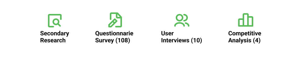
Research:
User interviews, Questionnaire survey,
Affinity mapping, Personas, Competitive analysis
UX Design:
Wireframing, Paper prototype testing, Interface Design, Prototyping, Usability testing
Team
Longzhe Zhang
Mofan Tang
Jiayi Chen
Zhaonan Xu
Timeline
10 Weeks
(2021 Spring)
Tool Used
Figma
Problem
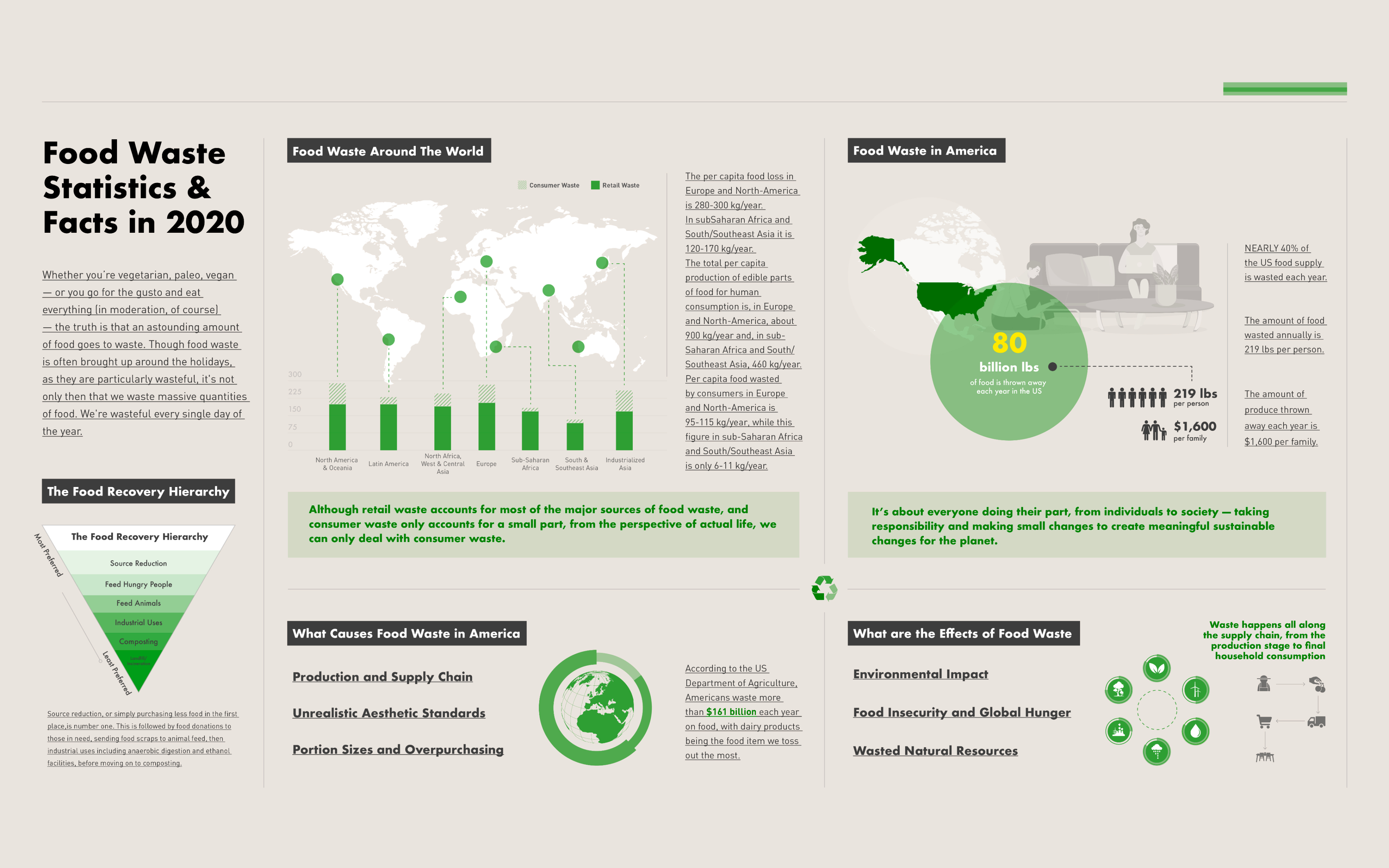
In the United States, the average citizen wastes 219 pounds of food each year, which is about 21% of the food they buy. In addition, the average American household loses about $1,600 a year due to this food waste. Because of the lack of creative solutions to utilize leftover ingredients, people often cook the same dishes repeatedly, which results in wasted food, time, and money.
“How might we help people who often cook at home reduce food waste?”
Solution
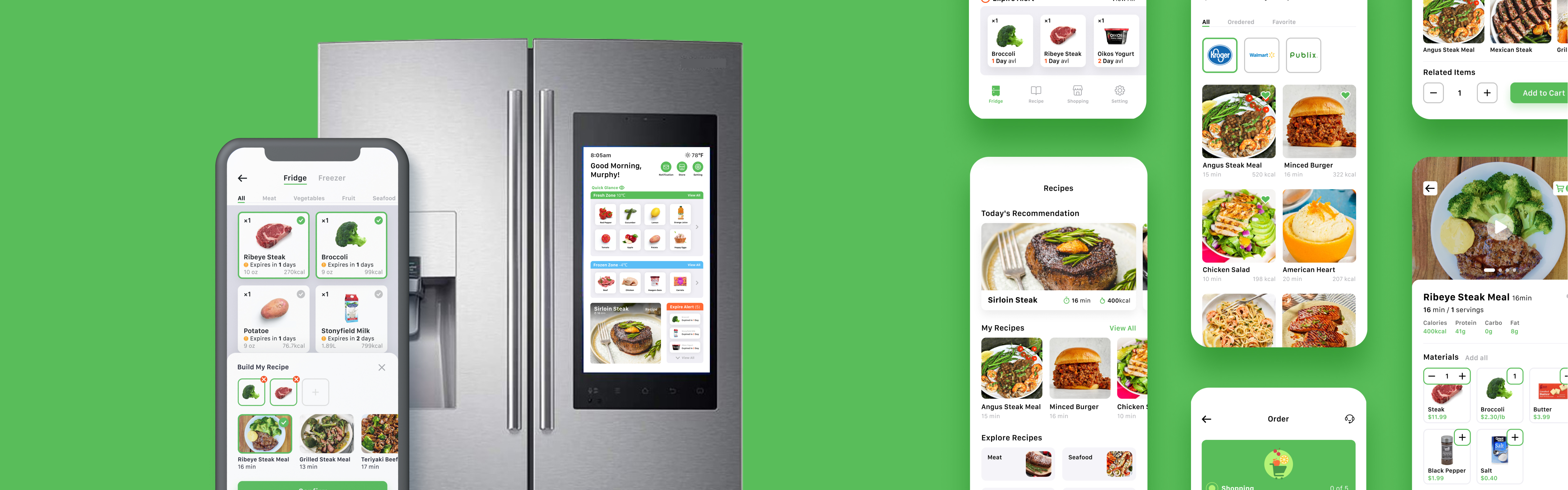
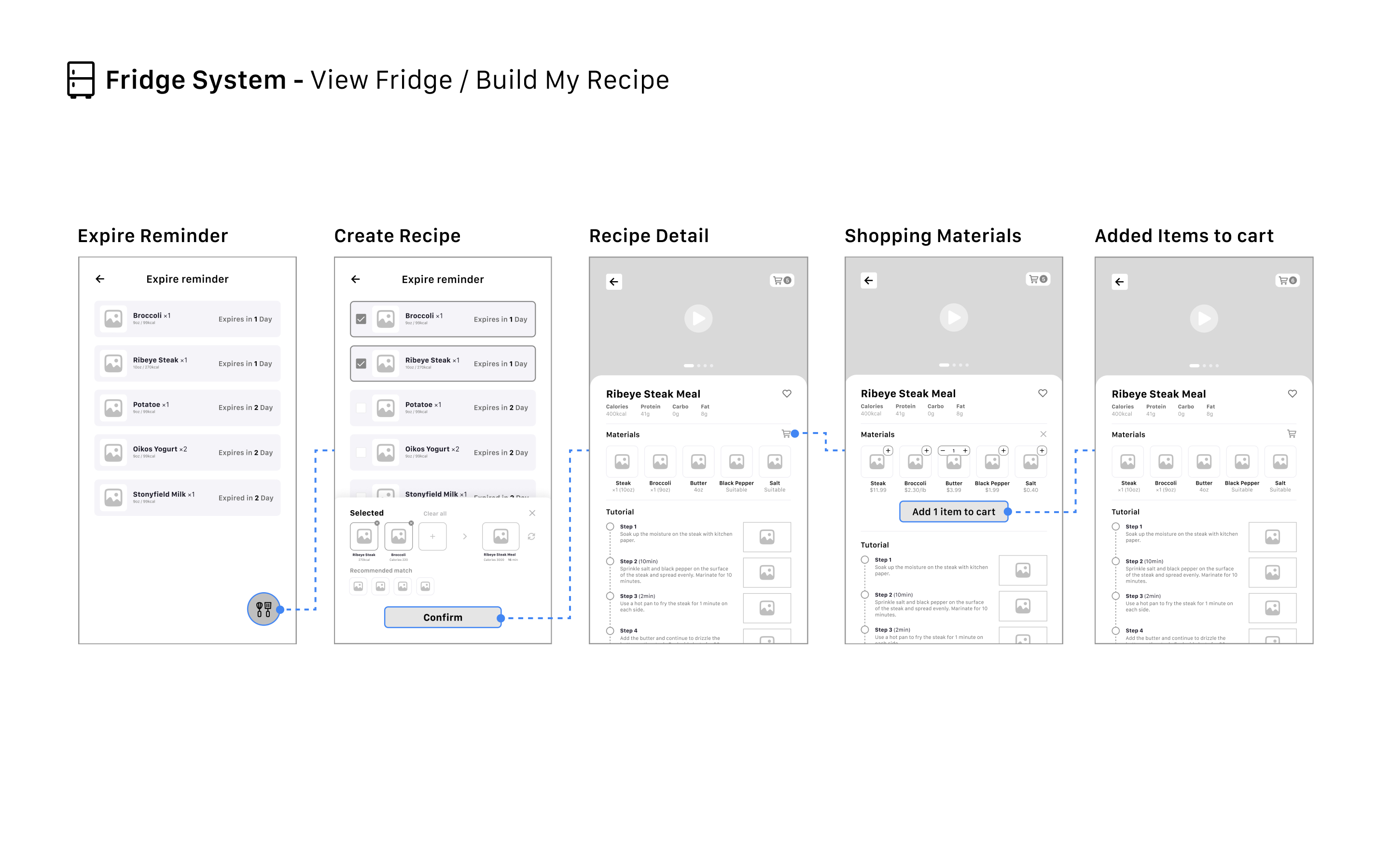
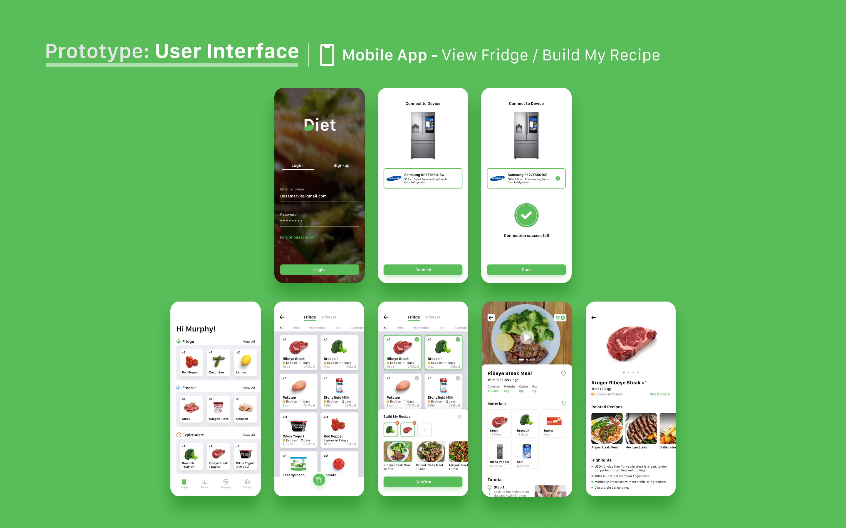
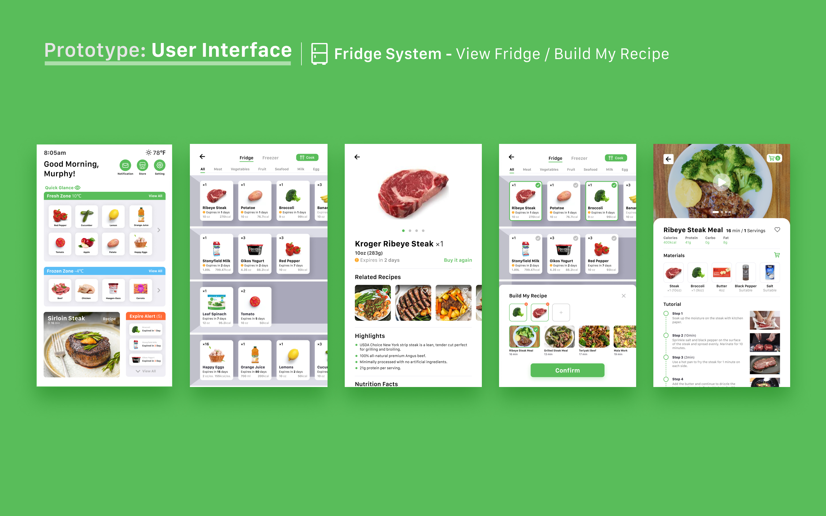
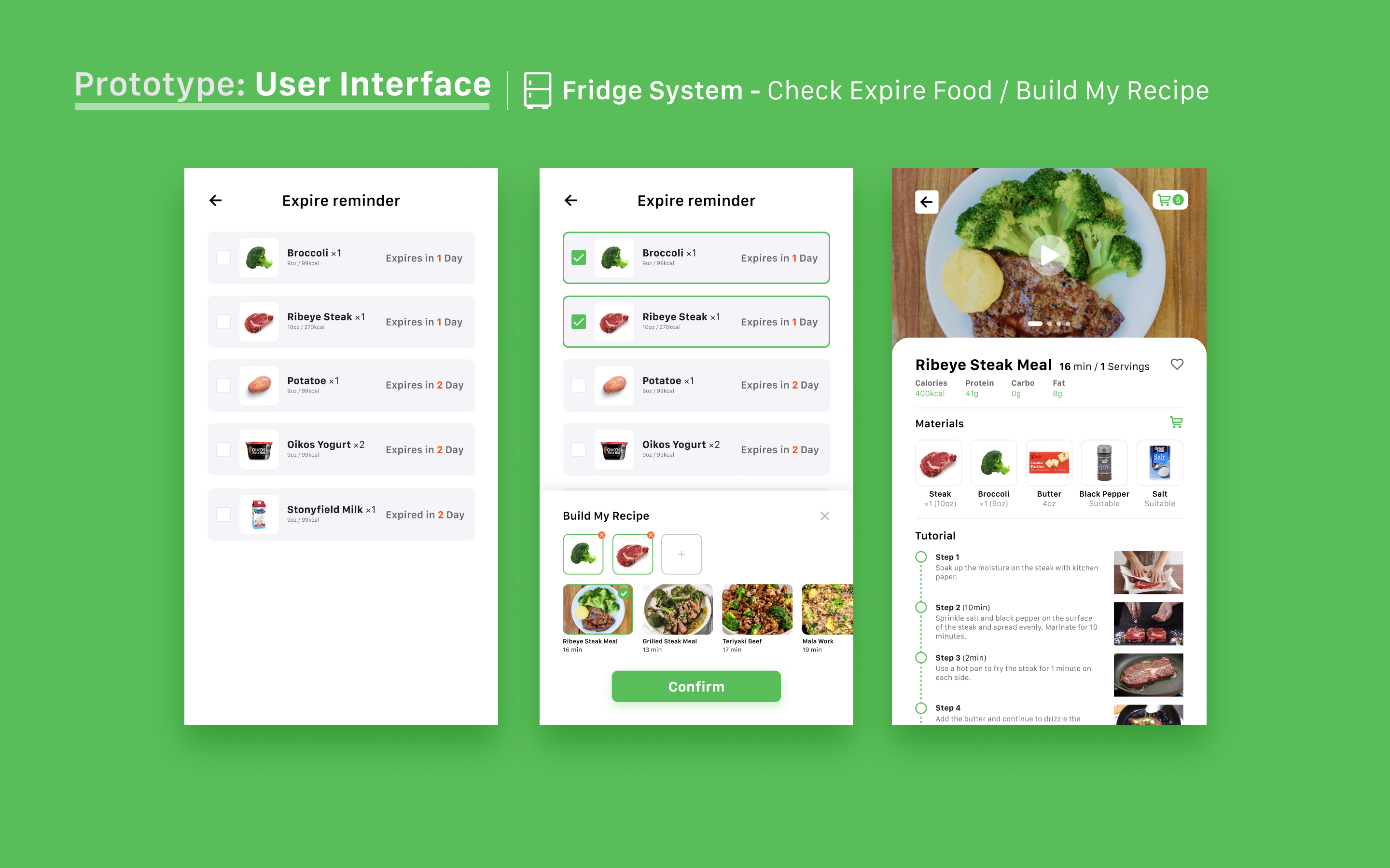
Food Expiration Reminder
- The system will remind users that some of their food items are soon to expire
- Users can combine any ingredients in their fridge and get hundreds of different recipe recommendations
- Clear and simple cooking tutorials helps users understand the recipe for fast and easy cooking
________________________________________________________________
Manage Food Easily
- Users can quickly obtain details about their food through food information visualization
- Easily browse dozens of recommended cooking methods for each ingredient
- Accessible cooking panel helps users combine any ingredients they prefer into their dish
________________________________________________________________
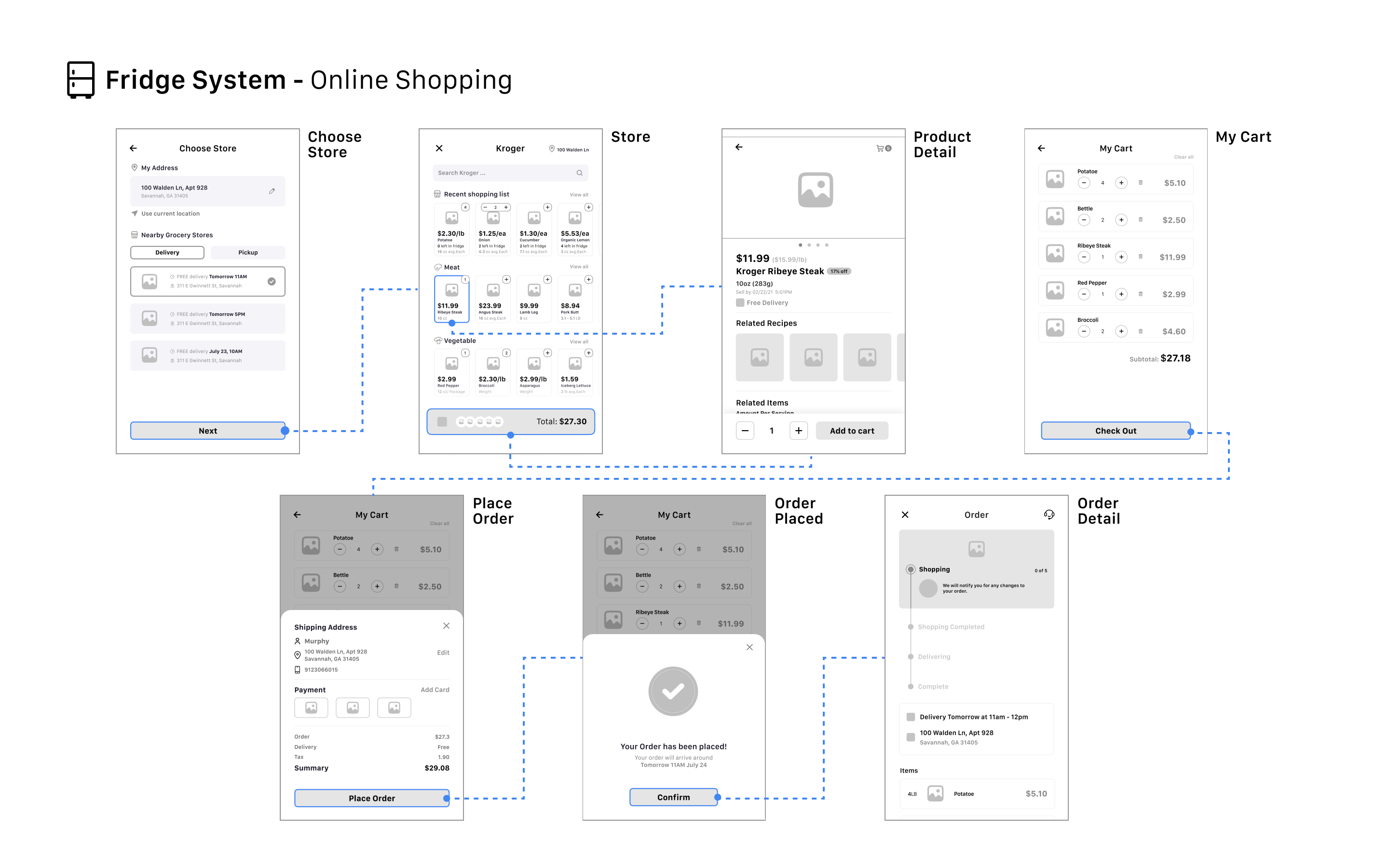
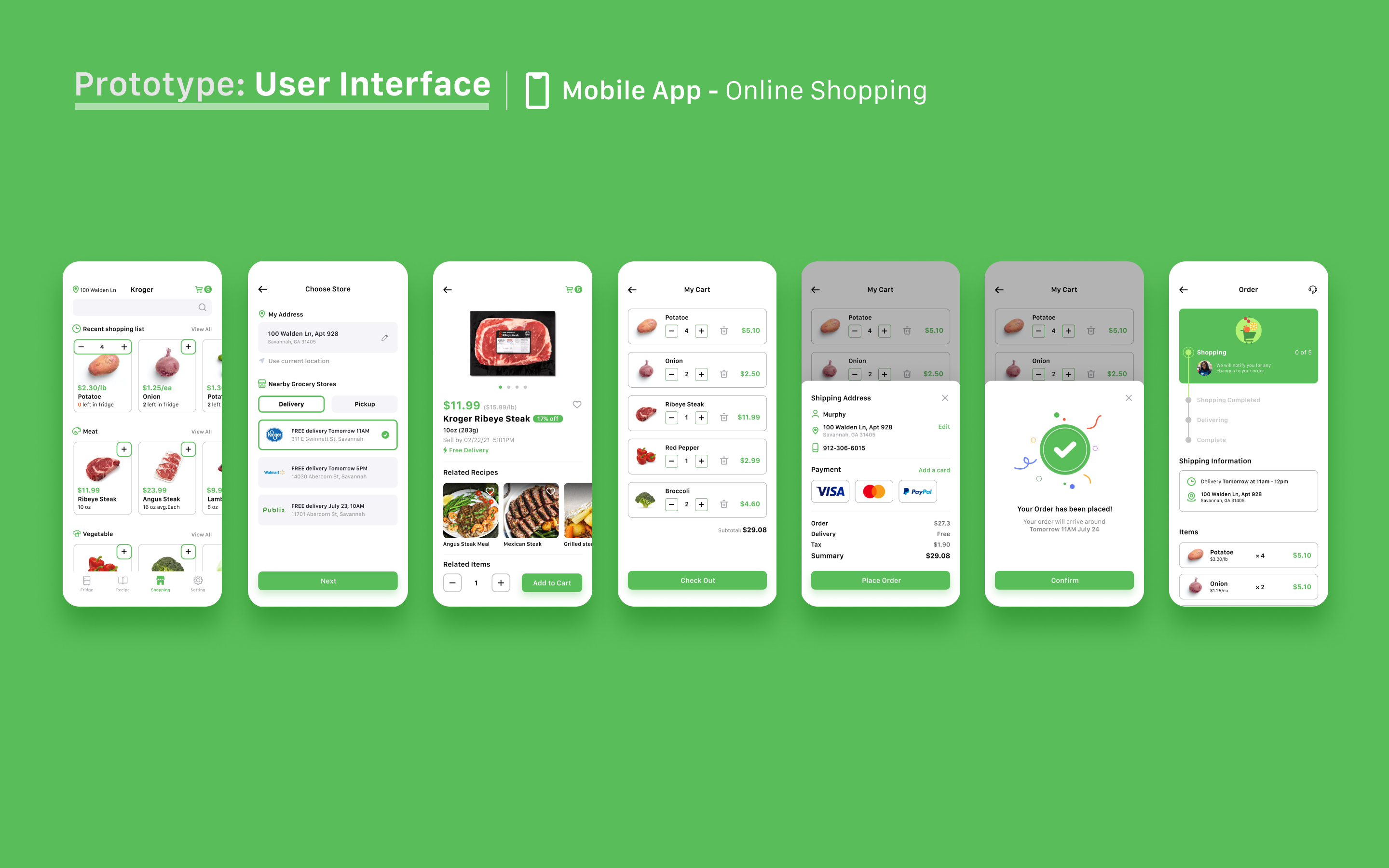
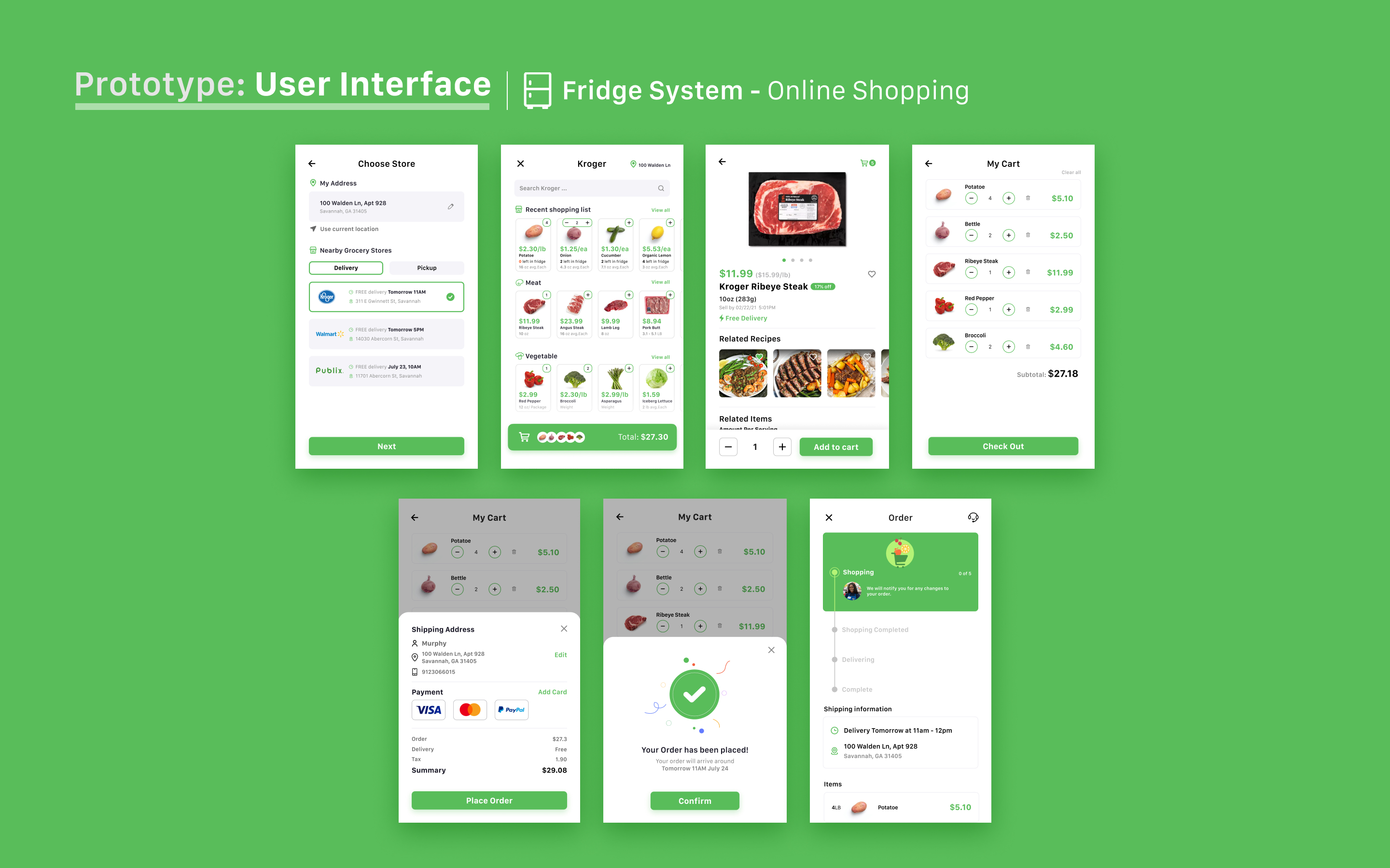
Online Food Shopping
- Displays the amount of food remaining in the refrigerator when shopping, improving decision-making performance
- Allows users to quickly add or delete items to promote shopping efficiency
- Recommend recipes when purchasing ingredients to assist users in selecting products
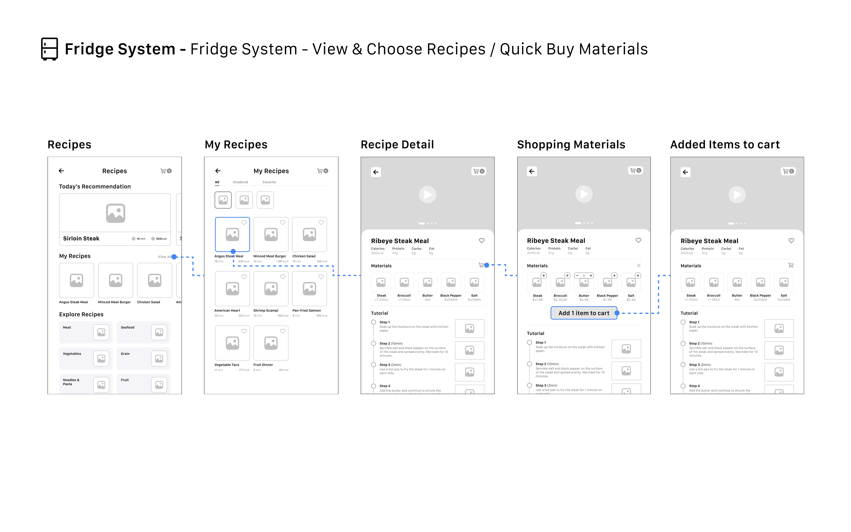
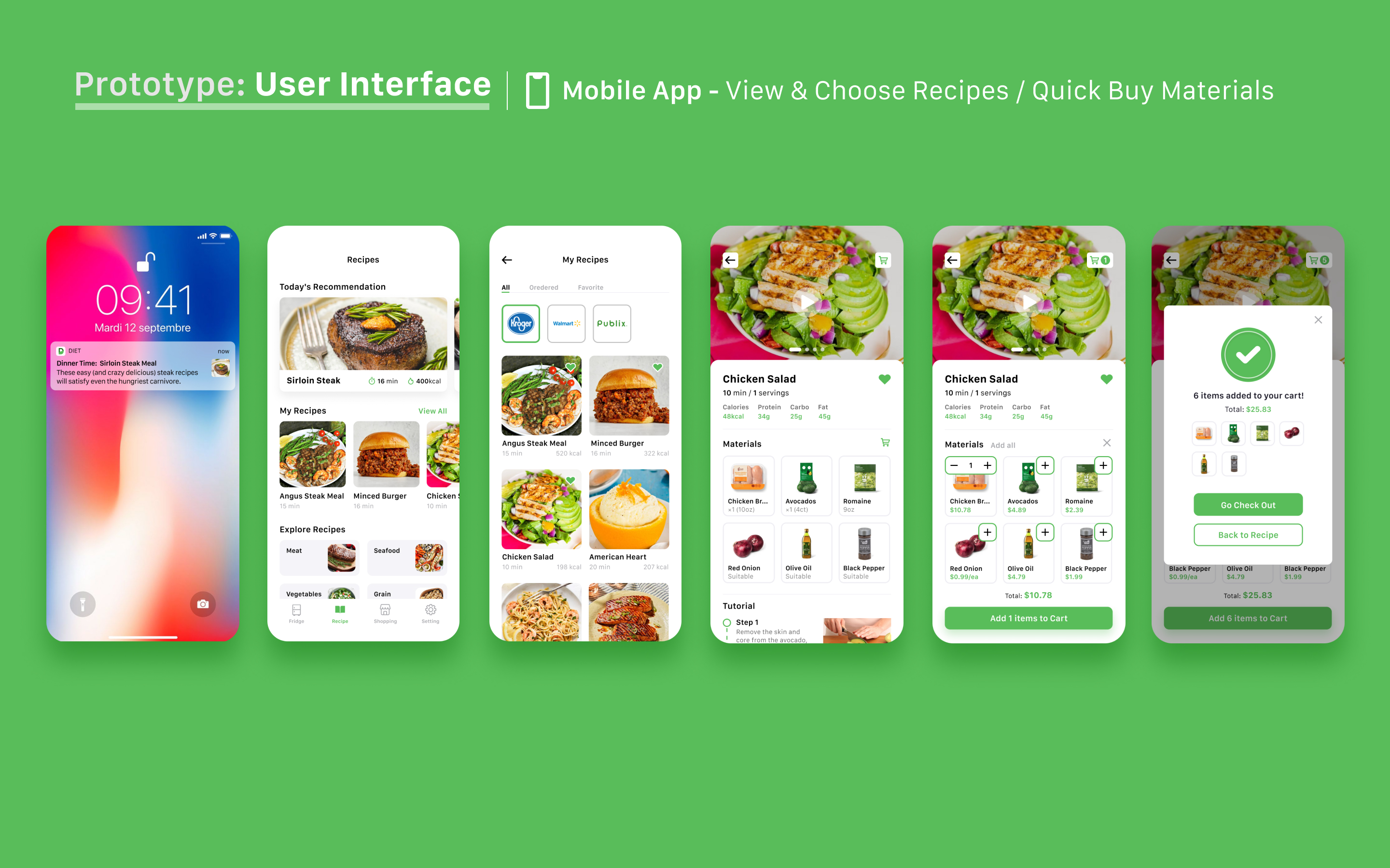
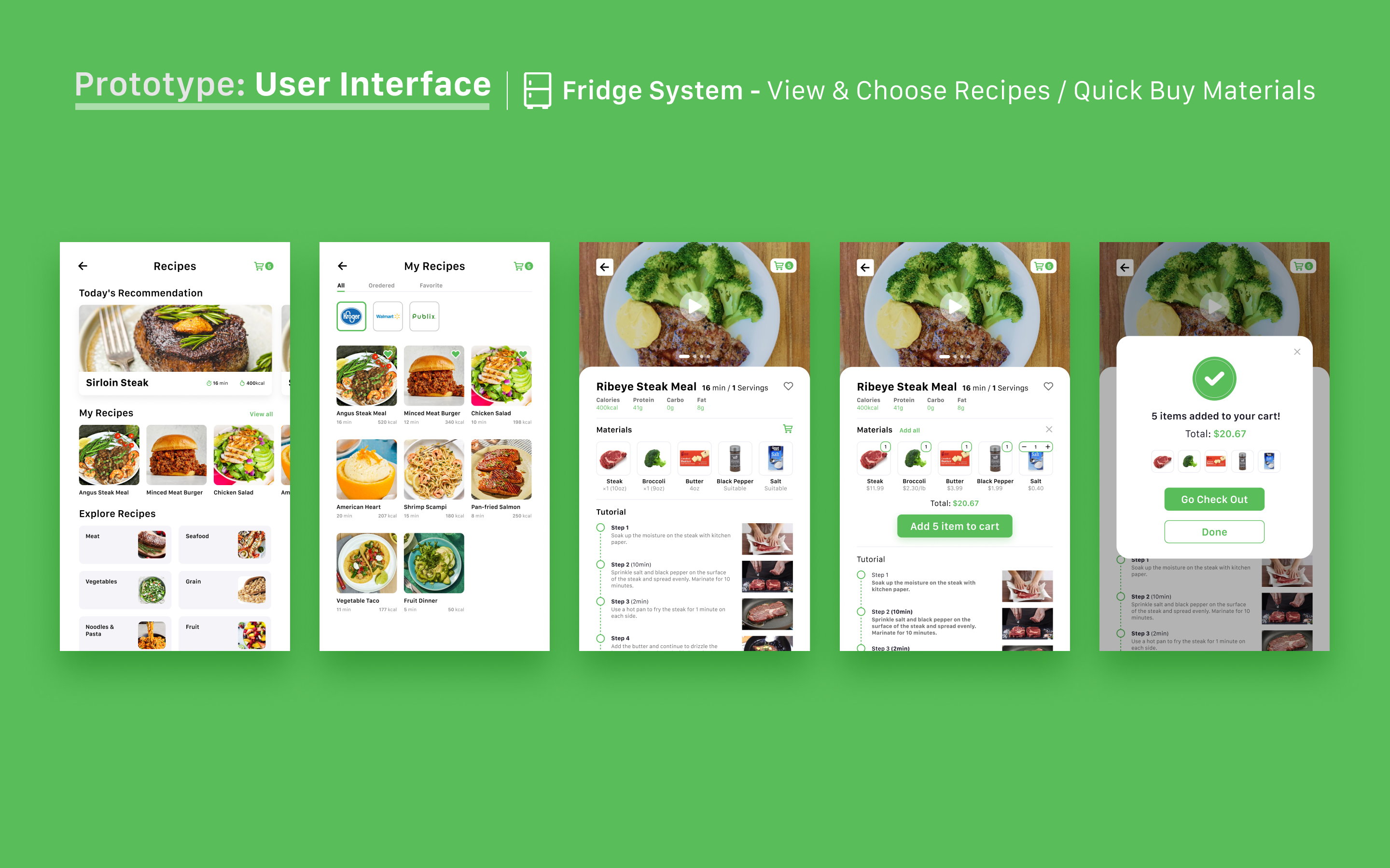
Explore Your Recipes
- Recommend different recipes for users every day according to the ingredients in their refrigerator
- Users can explore and collect any recipes and tutorials they favor
- Users can quickly buy the ingredients in the recipe through the quick 'add to cart' function
________________________________________________________________
The Process
Define
Problem Space
Defining Goals
Methods Selection
Scheduling
Research
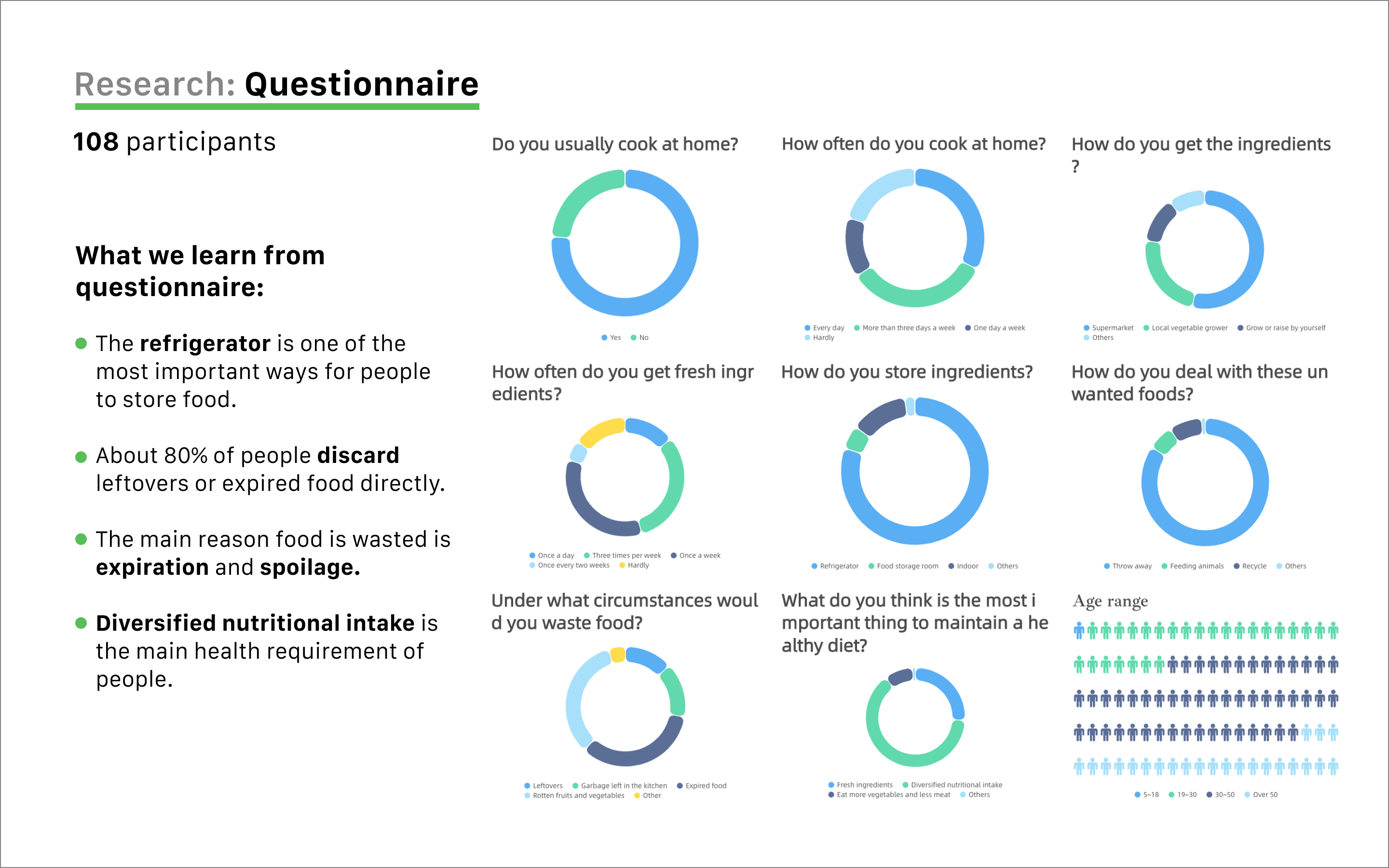
Questionnaire Survey
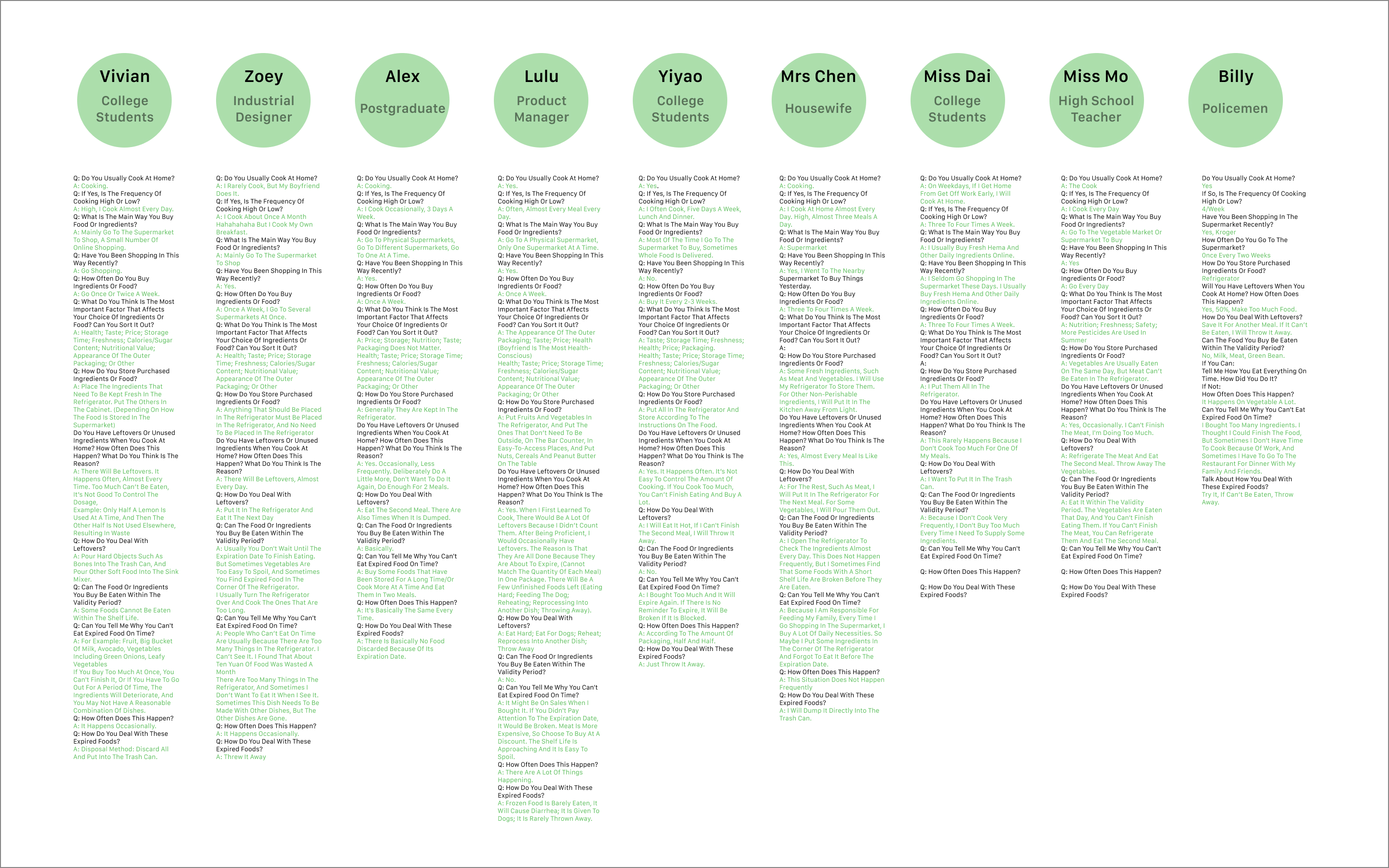
User Interviews
Affinity Diagram
Personas
Journey Mapping
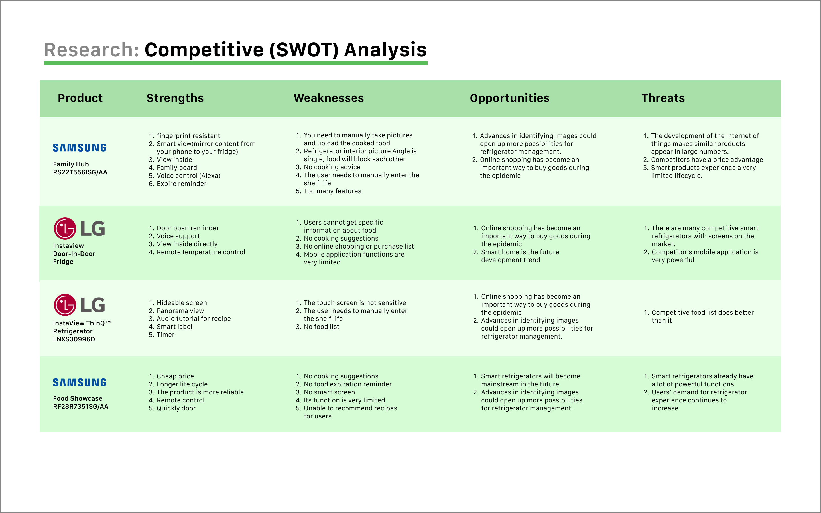
Competitive Analysis
Design
Sketches
Site Mapping
Paper Prototype Testing
Wireframes
Interface Design
Prototyping
Evaluate
Usability Testing
Reflection
Research
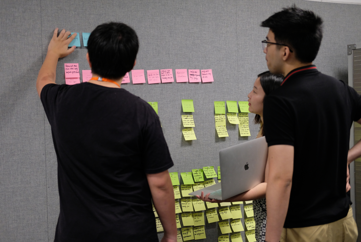
In this survey, we will focus on the three experiences of users; buying food, managing and storing food, and cooking food. This allows us to explore potential user pain points, the causes of food waste, and the direction of solutions.
Analysis Data (Affinity Diagram)
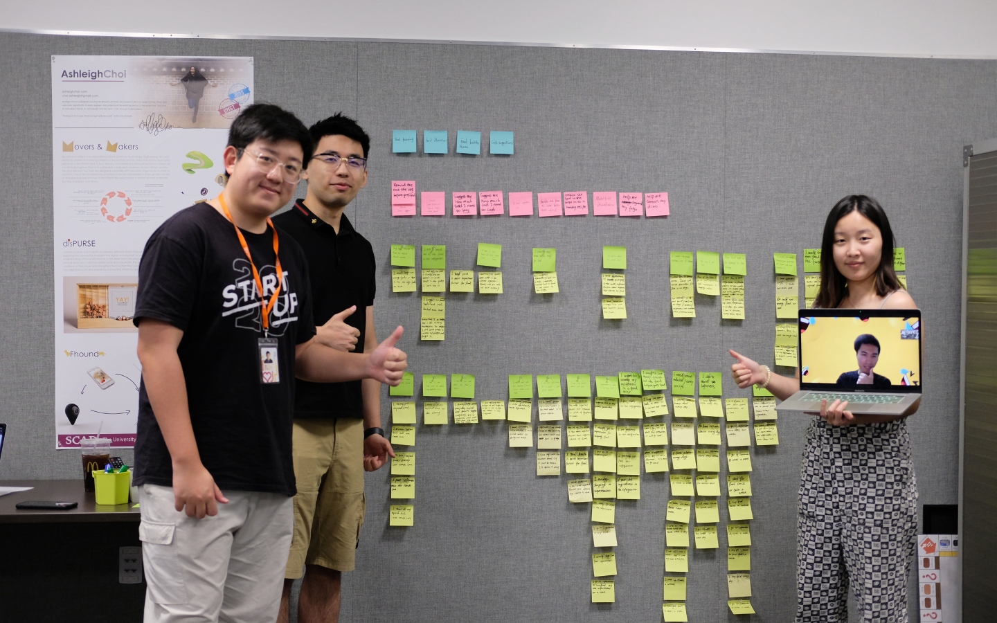
After concluding our user interviews, we collected all relevant data and used affinity mapping to categorize and filter the data. Through affinity mapping, insights are revealed to help us think about potential solutions.
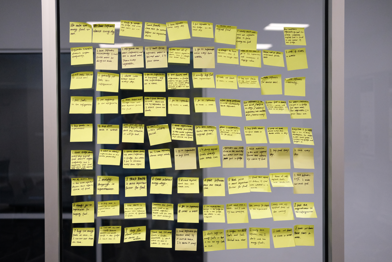
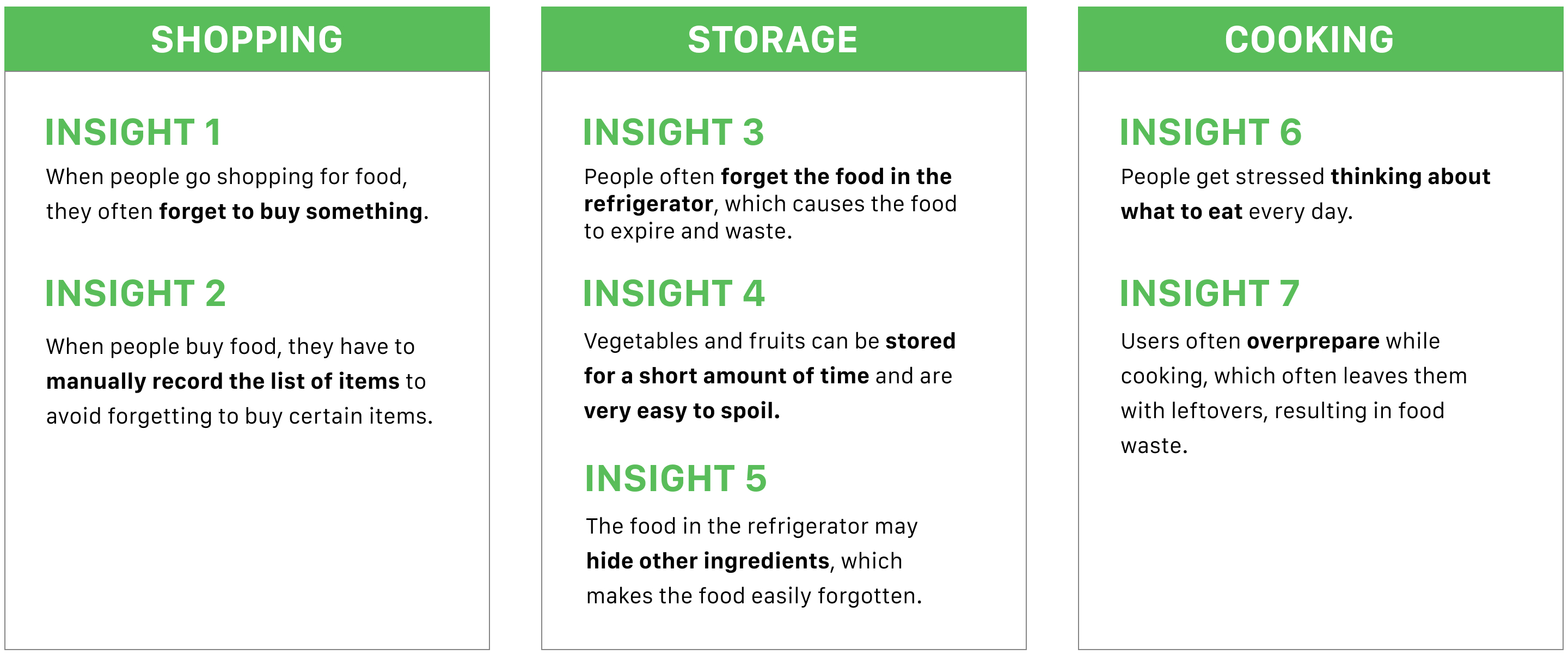
Insights
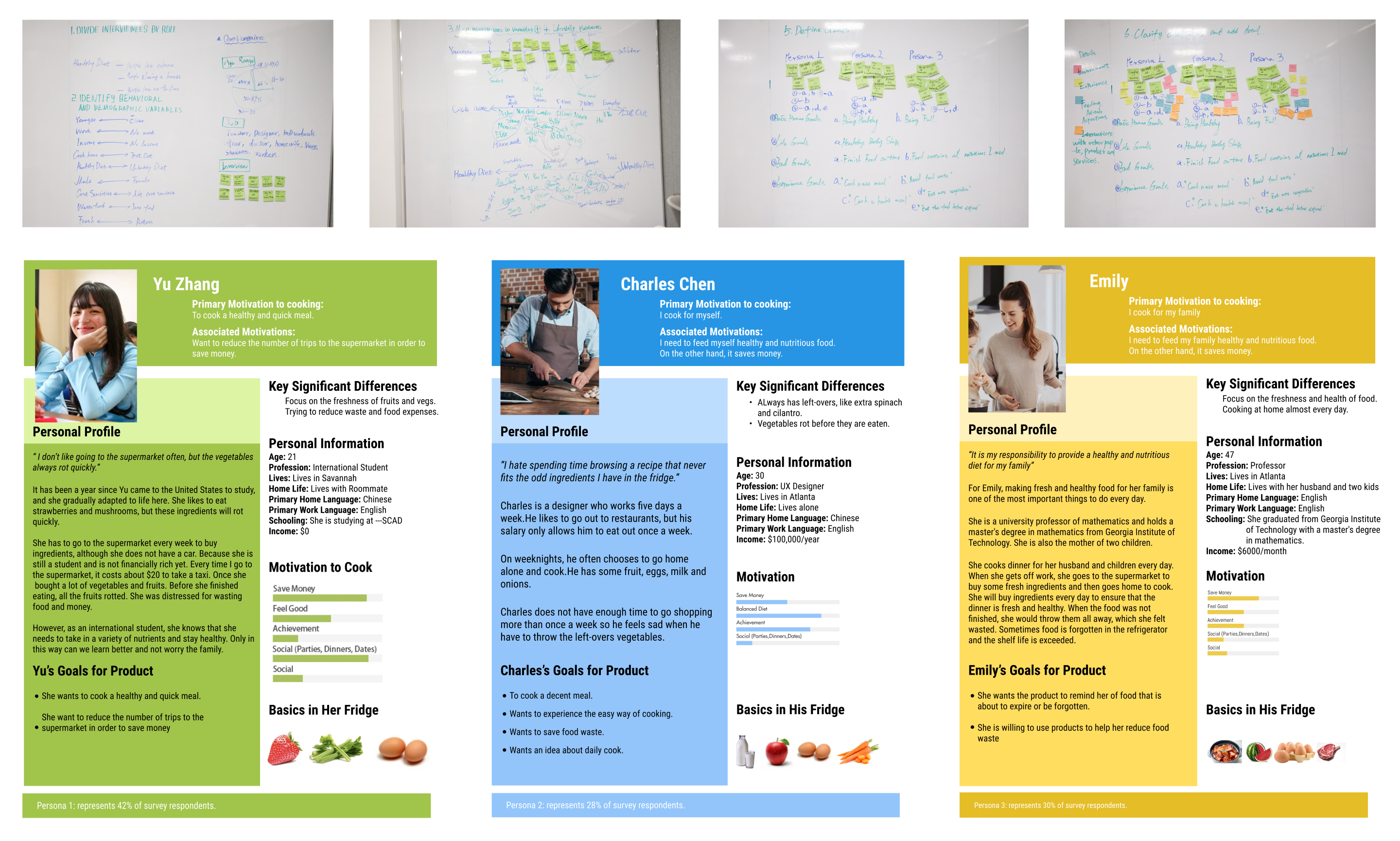
Personas
Based on the insights obtained from user research, we summarize three types of typical users with different characteristics.
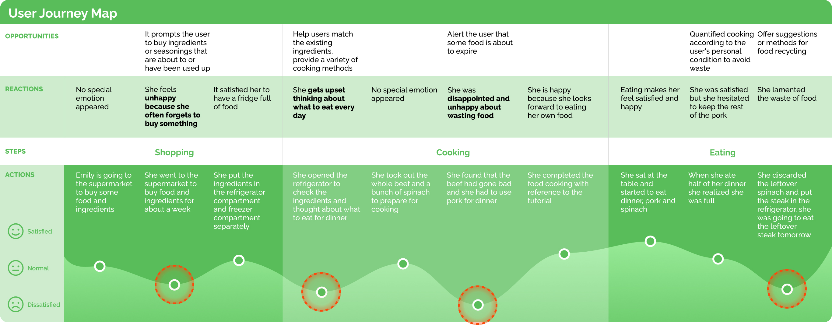
User Journey Map
We built a user journey map from data from interviews and user research to help us highlight user needs, pain points, and potential solutions at each stage.
Design
Sketching
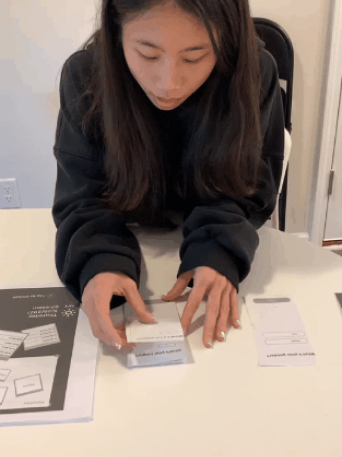
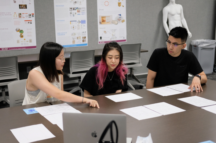
Paper Prototype Tesing
To get user feedback on our initial concept as quickly as possible, we conducted a paper prototype test with 5 participants to help identify issues and improve the product.
After the paper prototype test we summarize some key points:
- Most of the participants said they ignored or could not find the button to combine ingredients on the interface of the refrigerator system.
- It took participants a long time to get the recipe they wanted when combining ingredients because only one recipe was displayed for each combination.
- Participants preferred to select options directly when combining ingredients that were about to expire rather than clicking the ingredient combination button.

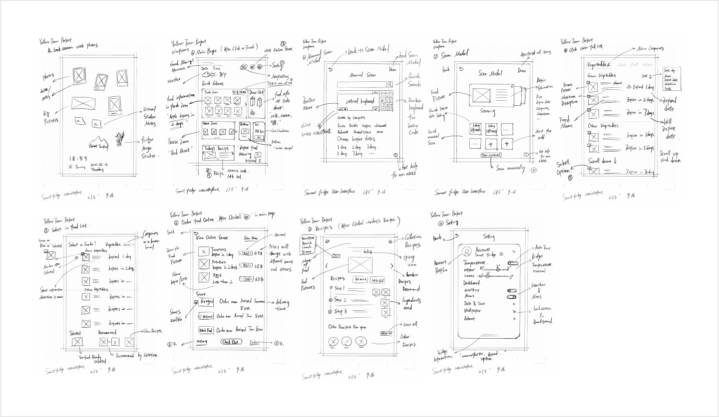
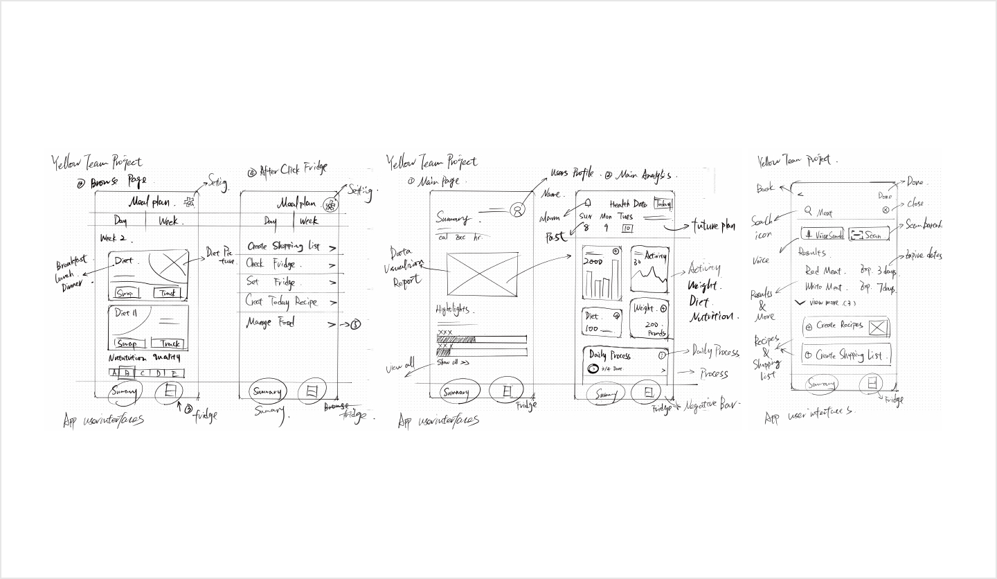
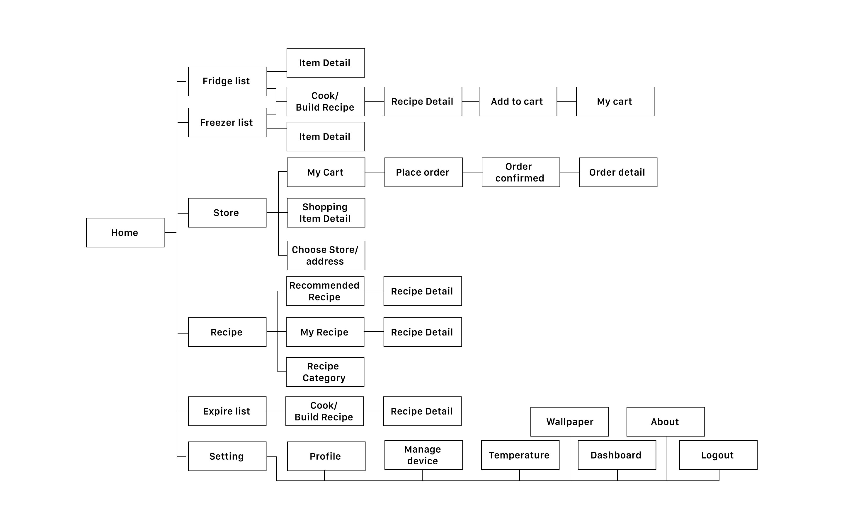
Site Map
Mobile App

Fridge System
Wireframe
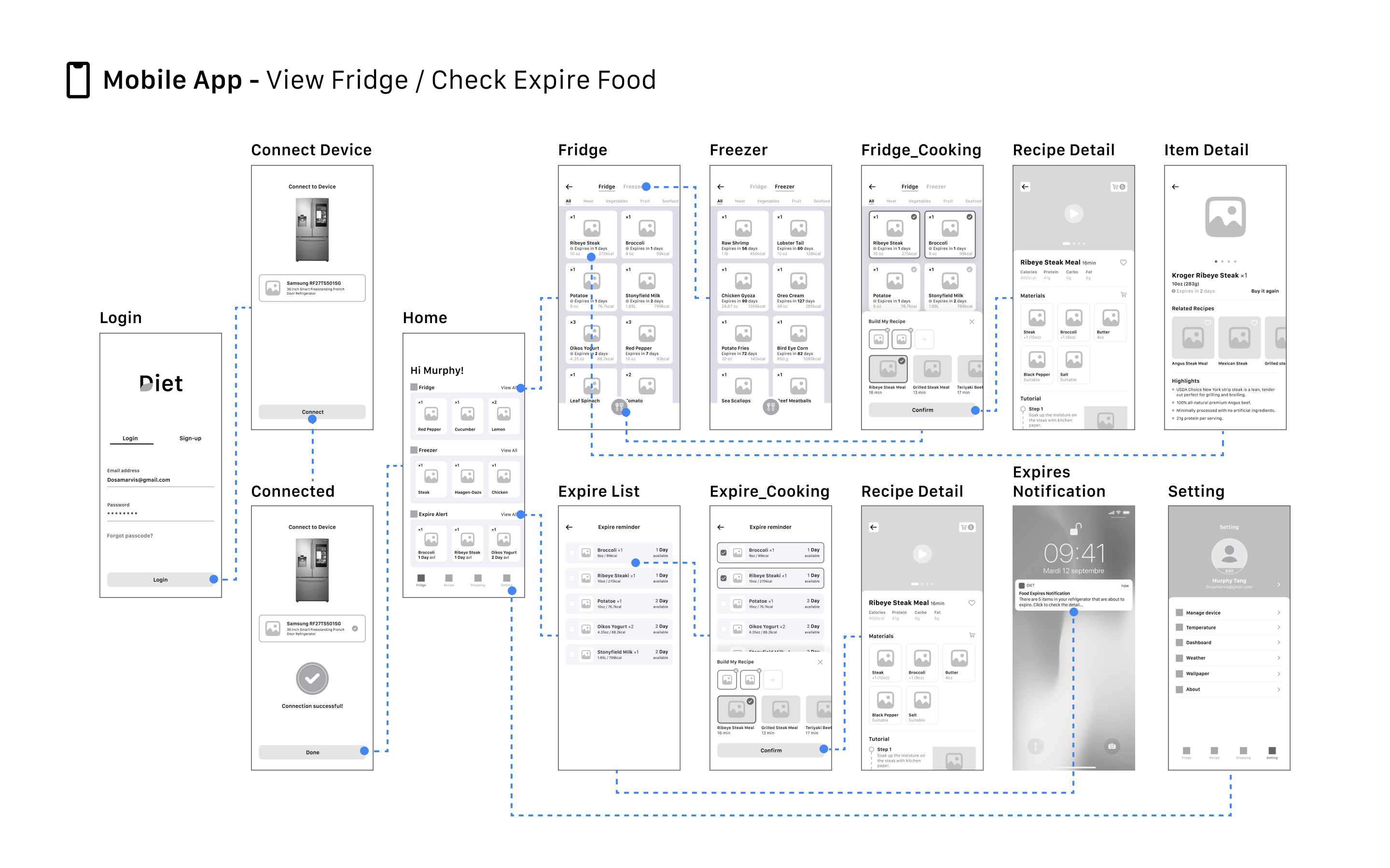
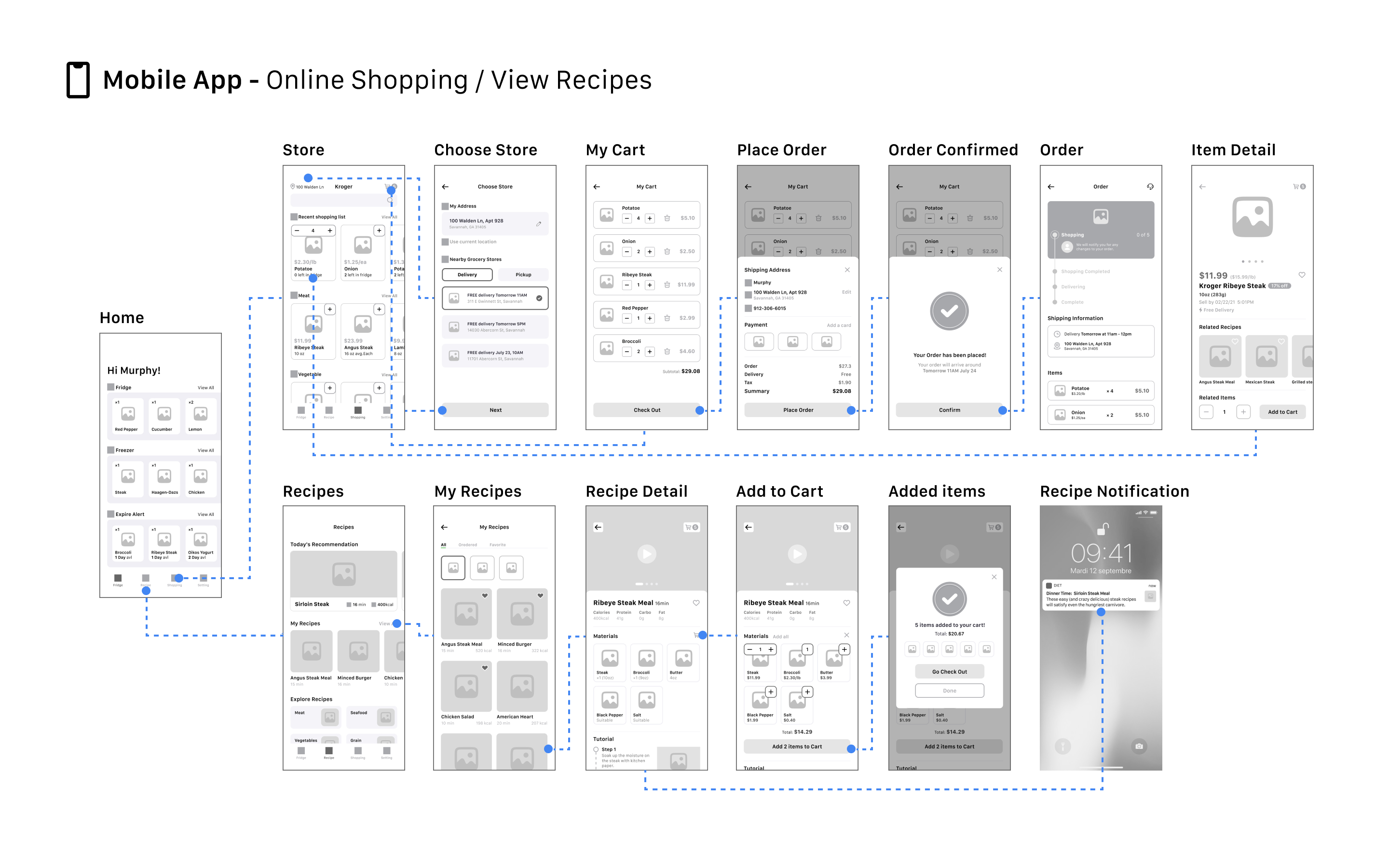
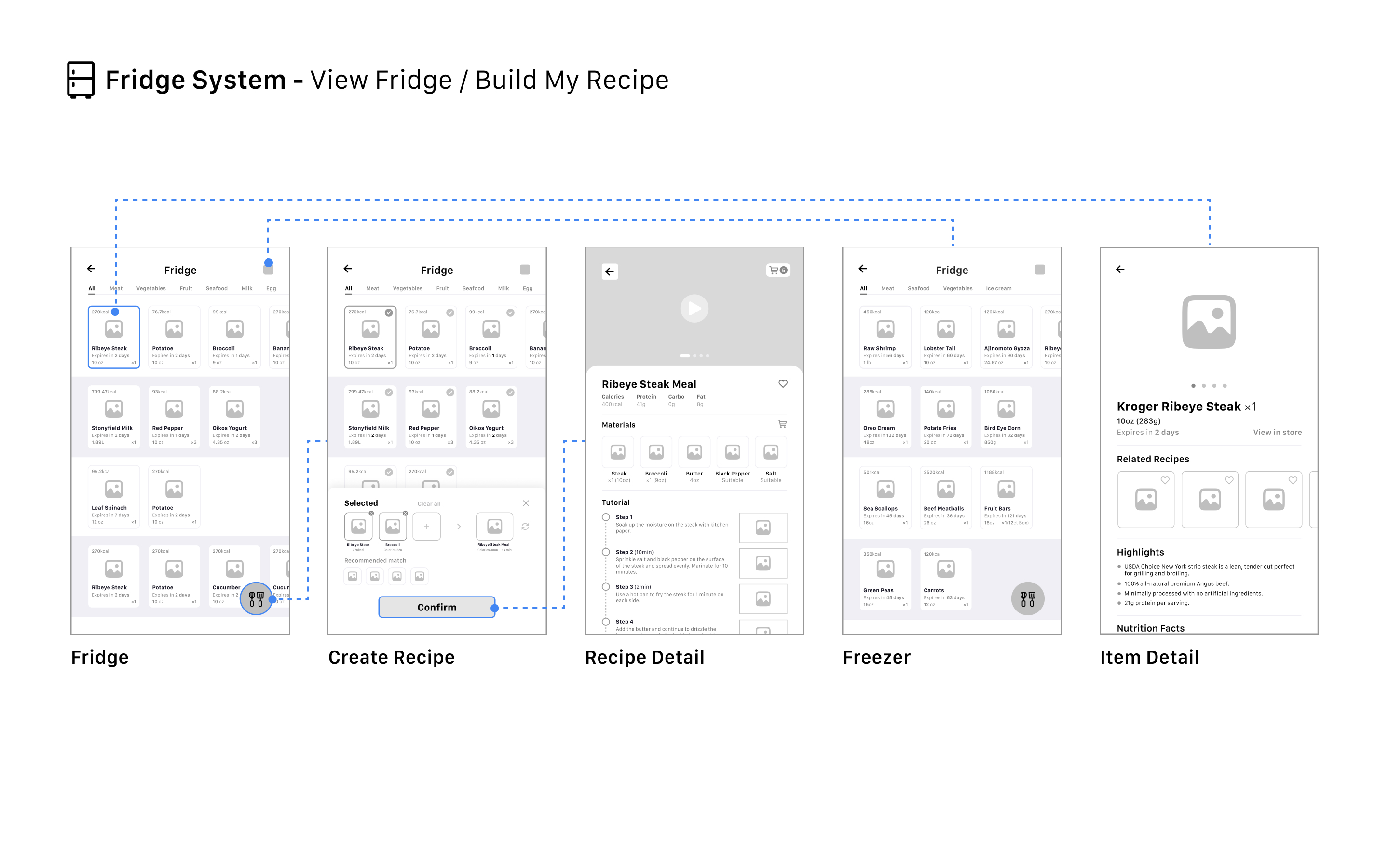
Interface Design & Prototyping
Evaluation
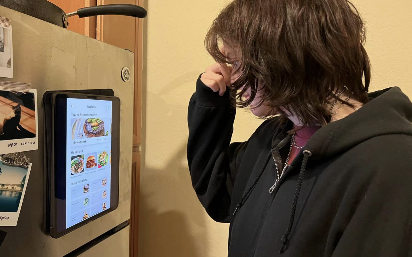
After we created this high-fidelity prototype, we decided to conduct usability testing to receive feedback for further evaluation. In order to restore the test scenario as much as possible, we put a 12.9-inch iPad on the refrigerator to test the refrigerator system. We invited 8 users for usability testing and recorded their feedback.
Hi-Fi Usability Testing
In this usability test, we first gave participants a brief introduction to the concept and purpose of the product. Then, we gave them a few tasks to complete independently. After collecting the feedback from the participants, analyzation of the data includes: how satisfied the participants are with the product, whether the participants completed all the tasks, how long it took for the participants to complete the tasks, their confusion with the tasks, etc. Here are some of the highlights we have outlined based on the test results:
75% of the participants thought this product could effectively help them reduce food waste.
87.5% of the participants believed the concept could help them reduce time and confusion when choosing a recipe.
62.5% of the participants believed that food quantity cues could help them improve their decision-making efficiency when shopping.
Here is some feedback of the issues based on usability testing and ideas for next steps to improve if more time is present.
Problem 1
Most of the participants were overwhelmed with the store page of the refrigerator system because of the excessive elements and information in the interface.
Idea
We hope to reduce the interface elements appropriately. On the other hand, if there is a chance, we hope to use the real refrigerator screen to test and find more problems in order to improve our product.
Problem 2
Some participants indicated that they would like their families to utilize the product together, which may help them prepare more suitable meals for their families.
Idea
We think that it is possible to provide users with a family sharing account where family members can share their favorite recipes and buy ingredients, which will ultimately save users time in communication.
Problem 3
Most participants felt that standing in front of the refrigerator for a long time to operate the interface made them tired, as well as the fixed screen position made participants of different heights feel uncomfortable when operating.
Idea
We think that the refrigerator system of the product needs to be simplified in structure. In consideration, we imagine that the refrigerator screen is attached to the refrigerator like a magnet instead of a fixed position.
Problem 4
Some participants felt that when combining ingredients, the panel blocked almost half of the food list, making users uncomfortable even though they had the option to scroll down the page.
Idea
We hope to potentially narrow down the card of ingredients when selecting combinations of food to allow users to get more options.

Reflection
I really enjoyed working on this project. Working with classmates from different backgrounds has been a great experience! I summarized some of my reflections on this project:
Reflections on user interviews
Questions should be asked in a logical sequence (story sequence) during the interview. Do not mention solutions during the interview, as this will increase bias.
Consider the differences of different terminals when designing
When designing multiple different terminals, it is necessary to think and design according to the specific size and usage scenarios of the terminal.
Give users enough choice instead of making decisions for them
Users feel uneasy and frustrated when they don't have enough control. During the test, we found that users were annoyed because they couldn't get enough choices when creating recipes.