DiDi Food
Optimizing the existing homepage information and functions of DiDi Food to help users improve decision-making efficiency.
My Role
Research:
Marketing analysis, Competitive analysis, User interviews
UX Design:
Interface Design, Usability testing plan
Timeline
7 Days
(2021 Fall)
Tool Used
Figma
Design Challenge Requirement
Please optimize the homepage according to your understanding of the food delivery business, and express your understanding of food delivery users by utilizing interactive design to think through the final solution.
Research
Business Background
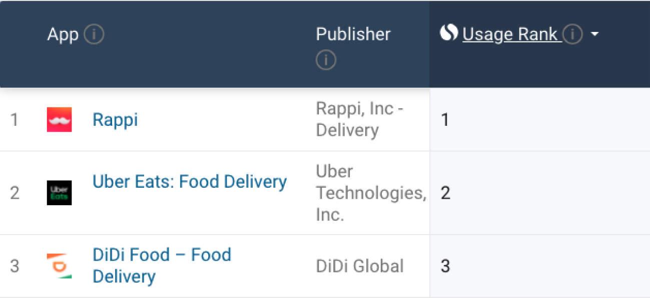
DiDi Food is one of Didi's major businesses in Latin America, including Mexico, Chile, Colombia, Peru, Costa Rica, Brazil, and other regions. In Mexico, DiDi Food has increased its market share by attracting a large number of SME merchants. Today, DiDi Food has become the top three takeaway platforms in Mexico with Rappi and UberEats, and is continuing to enter different Mexican cities.
Business Goal
DiDi Food is in the stage of continuous market expansion with the business goal of the product; to continuously attract new users to join the platform.
Marketing Analysis
- Mexico is a developing country, and according to a Euromonitor report, Mexico's economy has contracted sharply in the past two years. In addition, affected by the epidemic, the local economic recession has been exacerbated. In conclusion, Mexican consumers are generally very price sensitive.
- Mexico is a country of immigrants, including Indo-European, Indian, European and so on. This requires products to focus on food diversity to meet the needs of this multi-ethnic market.
- According to Euromonitor's report, Mexico's low-end, small-scale retail and food industries have been the fastest growing segments in recent years. This means that the platform needs to strengthen the attractiveness and advantages of small and medium-sized merchants, such as preferential discounts, sales, etc.
- Shipping and delivery methods within Mexico are underdeveloped in many regions, which means users may be more concerned about delivery times and punctuality.
Competitive Analysis

Rappi is the fastest growing on-demand delivery service company in South America, with a wide range of products and services including verticals such as: ordering food, medicine, groceries, and delivering personal items. Its advantage lies in its deep localization, providing more choices and services that locals want and need.

Uber Eats is the world's largest online food ordering and delivery platform, including 45 countries and more than 6,000 cities. Uber’s main business structure is similar to that of Didi, online car-hailing + takeaway, but it is mainly distributed in the mid-to-upstream market, with the price being on the high side.
Address Bar
The address bar expression of the three products adopts the method of directly displaying the address field and has a drop-down button to guide the user to edit the address. UberEats and Rappi use medium and bold font weights respectively for greater legibility.
DiDi Food

Uber Eats

Rappi

Search Field
The search bar of DiDi and Rappi is located at the upper part of the homepage. Compared with the search button located in the tab bar of UberEats, it has fewer operation steps and meets user search needs faster. Rappi's search bar field content is more user friendly.
DiDi Food

Uber Eats

Rappi

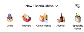
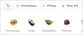
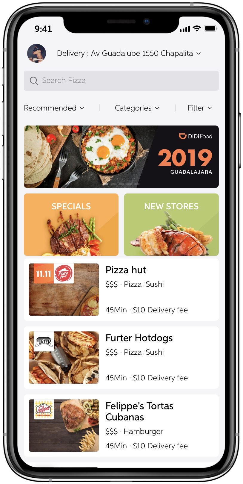
Categories & Filter
The category bars of UberEats and Rappi help quickly filter food or grocery categories in the form of icons and pictures swiping left and right. Both emphasize Deals and Promotions, and continue to attract new users through special offers. DiDi only uses the form of plain text + drop-down buttons, which adds redundant operation steps and has low recognizability.
DiDi Food

Uber Eats
Rappi
Banner
All three products use the form of sliding left and right to present the advertising banner, DiDi and UberEats use the form of carousel, and Rappi is the form of manual sliding visible on both sides.
DiDi Food
Uber Eats

Rappi
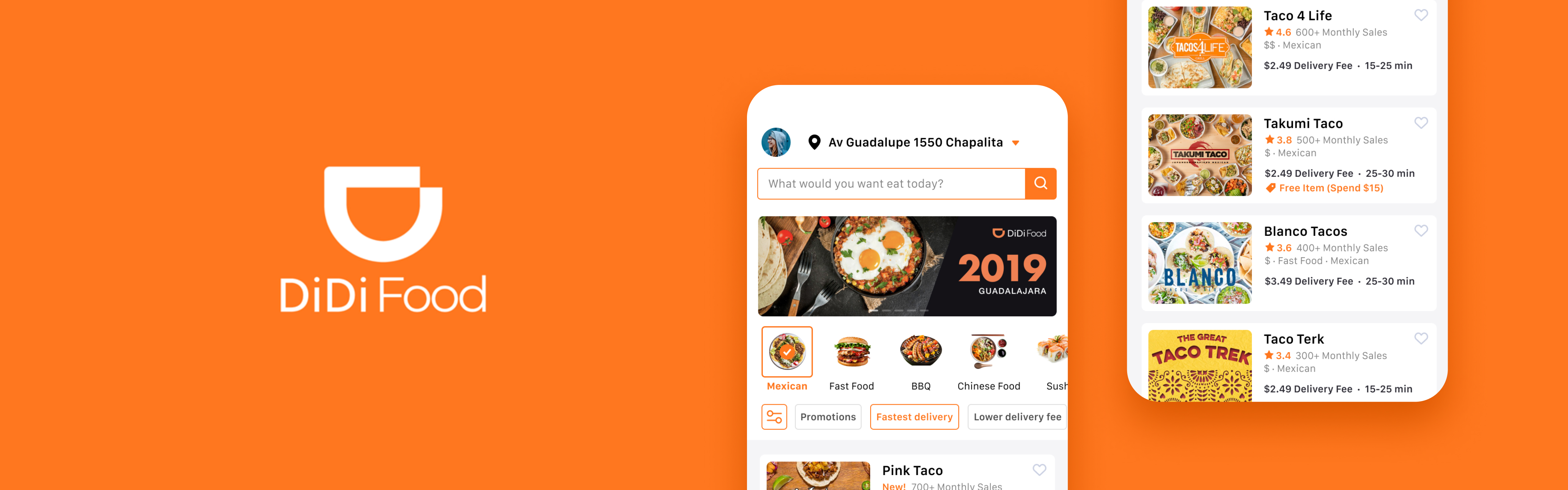
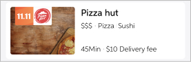
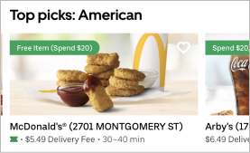
Cards (Restaurant)
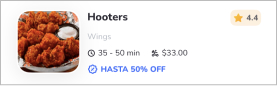
UberEats has classified the homepage merchant cards, and users can quickly view different types of catering brands without triggering the screening and classification, ultimately improving decision-making efficiency. On the other hand, UberEats provides a big picture of the product and emphasizes discount information and collectible buttons, providing users with a better decision-making reference based on delivery information. Rappi highlights offers and merchant ratings. DiDi only has basic merchant and shipping information, and the promotion information is not clear.
DiDi Food
Uber Eats
Rappi
Interview Insights
I conducted remote interviews with 6 users who currently live or previously lived in Mexico and summarized some insights:
Insights 1
The main reasons why users choose take-out services include: they are unwilling to spend time cooking, they are busy with work or studies and do not have enough time to cook, whereas take-out is convenient and fast.
Insights 2
Different users like to choose their own food types and tastes according to their own eating habits. Cuisine classification is one of the most important user decision-making factors, and the user stickiness is very high for restaurants that meet their tastes. Food pictures were an important factor influencing this judgment.
Insights 3
Since Mexico also has a consumption habit of tipping, users are also conscious of delivery fees and restaurant food prices. In contrast, users are more willing to spend money on food than delivery fees.
Insights 4
For unfamiliar restaurants, users make more decisions and judgments through ratings and sales.
Insights 5
Preferential discounts have a direct impact on prices, and larger discounts may even make users reduce their decision-making weight on delivery time.
Insights 6
Users' attention to header banners is more limited to discounts or other promotions. For information that is not of interest, users will simply ignore it.
Optimization Goal
Goal 1
Optimize the classification and filters of the home page to improve the user's decision-making efficiency for types and conditions.
Goal 2
Redesign the merchant card, strengthen the information that users focus on based off of competing products and user feedback results, and help users shorten the decision-making time for selecting merchants.
Design
Address Bar
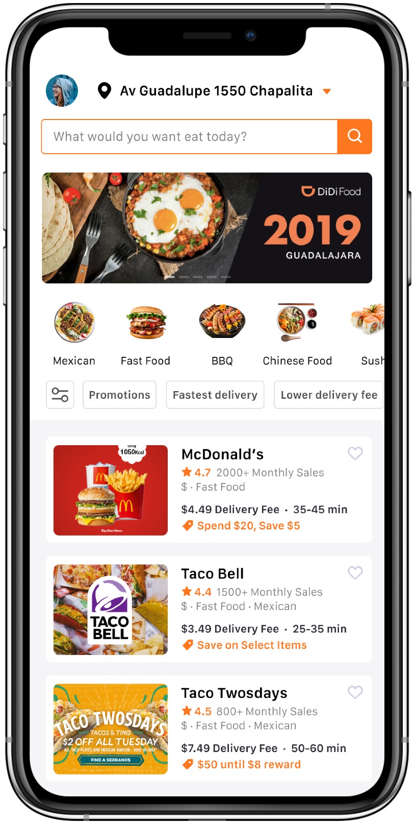
The color of the address icon and drop-down button has been increased and the font has been bolded to improve visibility and recognizability of drop-down operations.
Search Field
Improve the visibility and brand recognition of the search bar with branded colors and buttons, and make it more user-friendly by using query sentences as prompts.
Category & Filter
Place categories and filters adjacent to business listings to avoid fragmentation of related content. Quickly provide users with an intuitive decision-making basis for category selection through food pictures and fields. The filter provides users with the most frequently used filter conditions to quickly sort by sliding, reducing redundant operations and improving filtering performance.
Cards (Restaurant)
Emphasis is placed on the decision-making information that users are concerned about such as; delivery fees, delivery time, ratings and preferential activities, which will aid users to make quick judgements revolving decisions. Assists in providing merchant sales, price ranges and restaurant types. The favorite button helps users mark frequently visited merchants to improve the usability of a quick repurchase.
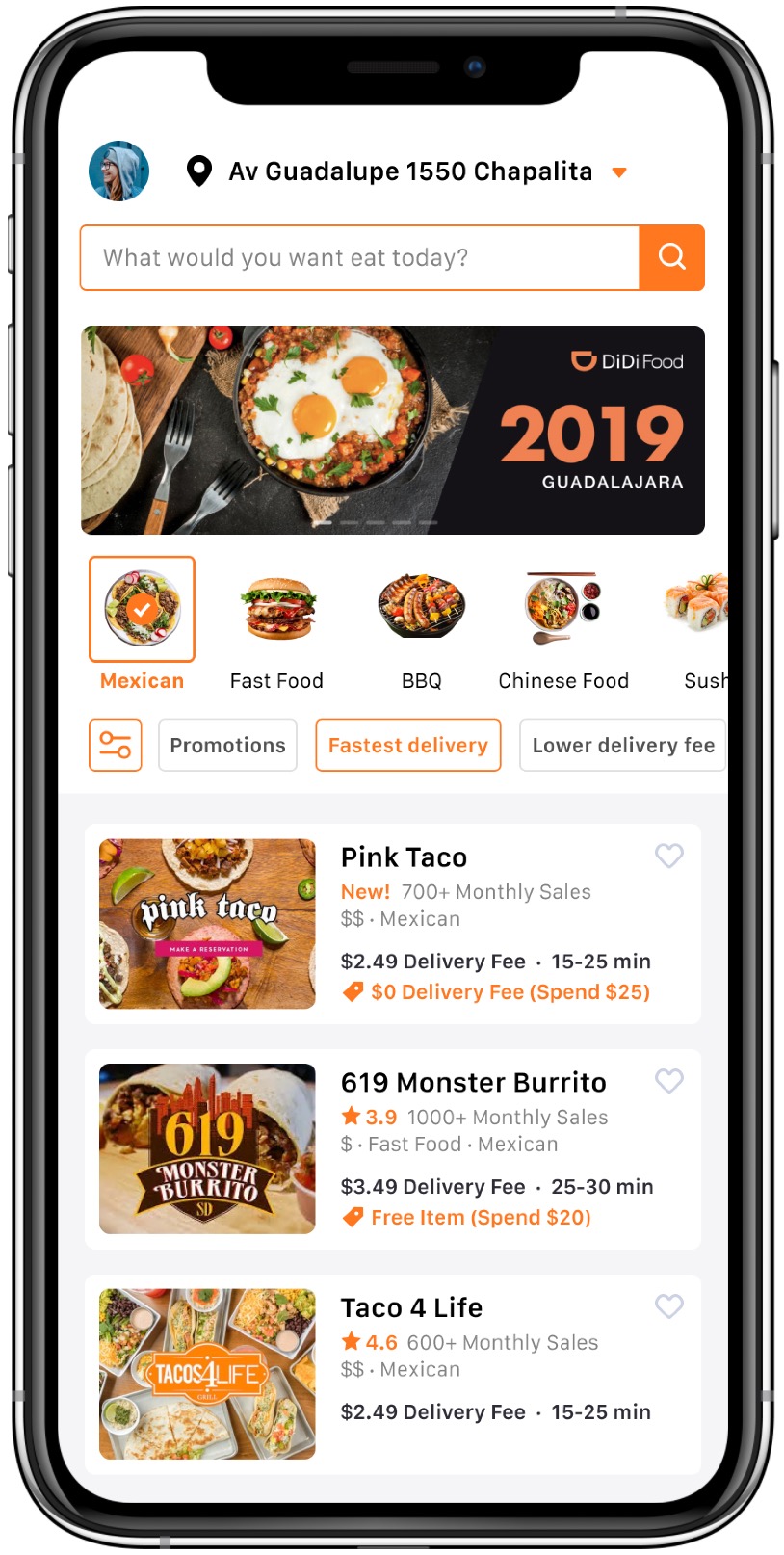
Homepage
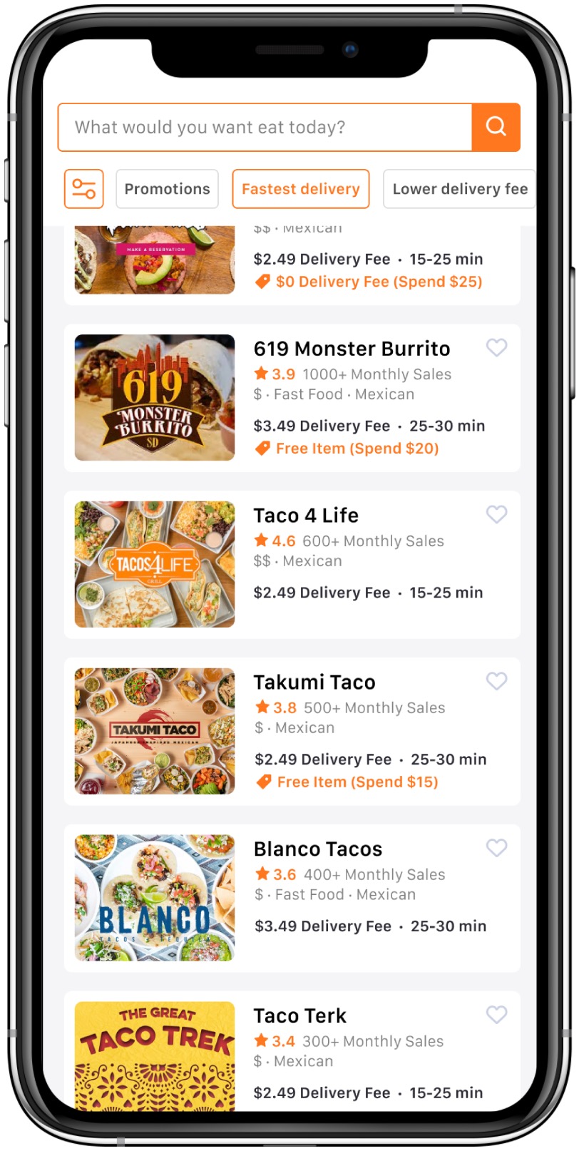
Homepage (Scroll down)
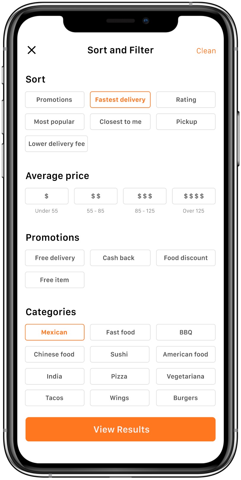
Sort & Filter
Homepage (Old)
Homepage (New)
Next Steps
If I have had more time, I would love to have usability testing with Mexican food delivery platform users in different scenarios. This will help me verify whether the optimized home page helps them make decisions more efficiently or matches their preferences and expectations. In addition to these conditions, I made a rough usability testing plan.
Usability Testing Plan
Purpose
In order to verify whether the optimized homepage can help users improve the efficiency of selecting restaurants and complete orders.
Equipment
iPhone X / 11pro (in person) or Figma (remote)
Participants
15 participants(including: 5 new DiDiFood users; 5 regular DiDiFood users; 5 competitor users)
Scenarios
Select several high-frequency user scenarios based on the personas to let users complete the task of ordering a food delivery. For example, "On weekdays you need to order a food delivery for lunch, use DiDi Food to find the food you want and complete the order."
Metrics
Subjective Metrics: Ask the user if they are satisfied and diligent with the experience after completing the usability test; as well as asking the user if the whole process is easy to operate.
Quantitative Metrics: The amount of time it takes the participant to complete the task; participant's success rate in completing tasks; number and level of mistakes made by participants on the test; participants' usage of optimized buttons and cards.


